
You will find muted beige, a single serif, soft gradients that go nowhere, slow-motion lifestyle shots of someone holding a coffee cup near a window, and copy that sounds like a mood rather than a message.
“Elevated.”
“Timeless.”
“Crafted for modern living.”
“Designed for you.”
Now scroll to the next one.
You will find the same palette, the same font, the same copy, the same window, and a different logo.
There is a word for this. It is called blanding, and it is the branding equivalent of hanging “Live, Laugh, Love” on every wall in every room of every house and calling it interior design. It is aesthetic without identity, polish without personality, the visual equivalent of saying absolutely nothing in the most tasteful way possible.
This is the state of branding in 2026 and it should embarrass all of us. Not because these brands look bad, they don’t. They look great. That is the entire problem. They look so great, so polished, so professionally tasteful that they are completely, thoroughly, strategically invisible.
Let me give you some names.
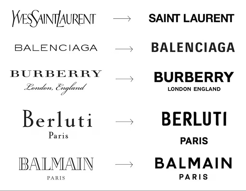
In luxury fashion, Saint Laurent, Burberry, Balenciaga, Berluti, and Balmain all swapped their heritage wordmarks for near-identical bold sans-serif capitals within a few years of each other. Decades of visual equity, centuries of heritage in some cases, all flattened into the same clean block letters. If you lined all five logos up side by side in black and white, the only thing separating them would be the letters themselves. The typographic style, the weight, the spacing, and the tone are identical.
Here is the detail nobody talks about: it was not even an independent convergence. Peter Saville designed both Calvin Klein and Burberry’s rebrands. Bureau Borsche handled both Balenciaga and Rimowa. The fashion houses did not all accidentally arrive at the same answer. They hired the same people and got the same result, then called it a rebrand. That is not strategy. That is a shared mood board dressed up as creative direction.
I know this firsthand. I spent years inside Lenox working across their licensed brand lines including Kate Spade and Donna Karan. I watched how brand decisions get made at that level up close, the committee approvals, the trend reports, the conversations about what feels “elevated” enough for the category. I watched how quickly the pressure to look like the competition overrides the instinct to look like yourself. These are not small brands run by people who do not care. They are established names with real heritage, real equity, and real people trying to protect it. Still, the gravity of sameness pulls. That is how powerful it is. If it can happen inside a company with that much brand history to draw from, it can happen anywhere.
The problem does not stop at luxury fashion either. Move into the DTC space and it gets worse. Caraway Home, MUD\WTR, Blueland, Rhode Skin. Line up their websites and squint. You will see the same soft palette, the same lifestyle photography, the same understated wordmark, and the same clean-girl aesthetic selling completely different products. Caraway sells cookware. MUD\WTR sells a coffee alternative. Rhode sells skincare. Open all four in separate tabs, strip the logos, and try to match the brand to the product. Most people cannot. That is not a design coincidence. That is an industry that has collectively decided looking expensive is the same as being memorable, and it is wrong.
It got so bad that in 2024, two influencers ended up in federal court in Texas because their brands looked identical. Sydney Nicole Gifford sued Alyssa Sheil for copying her beige aesthetic, her cream-and-neutral-toned content, her minimalistic staging, her monochromatic product shots. Two separate people, two separate businesses, built on the same beige foundation, indistinguishable enough that one thought she had legal grounds to protect it. The court found the aesthetic too generic to own. Which is the whole point. When your brand looks like everyone else’s, you own nothing.
Premium sameness is the cult of looking expensive while saying absolutely nothing. It is what happens when an industry full of smart people collectively decides that safety is a strategy, that polish is personality, and that if you just buy the right template and the right font pack and the right preset, a brand will materialize on its own. It will not. It never does. What materializes is a very expensive costume on an empty room.
I want to be clear about something before we go further. I am not talking about aesthetics. I am not saying beige is bad or serifs are wrong or that you need to go make something loud and chaotic to prove you have a point of view. Some of the most distinctive brands in the world are quiet. The difference between quiet and invisible is not volume. It is specificity. Quiet brands that work are specific in ways that loud brands never need to be. Their restraint is intentional, not default. Their palette belongs to them because of what it communicates about exactly who they are, not because it was sitting there in a Squarespace template when they signed up.
That distinction is everything, and most brands have completely abandoned it.
Here is how it happened. Website builders raised the floor. Squarespace, Showit, Webflow, they made it genuinely possible for anyone to have a polished, responsive, professional-looking online presence without a design background. That is a real achievement and I mean that. The problem is that “polished and modern” quietly became the full personality of an enormous slice of the internet. On top of the builders came a whole market of premium third-party templates selling high-end layouts at premium prices. Many of them are beautifully made. Many of them also look like they were designed for the same fictional founder with the same curated bookshelf, the same oat-milk latte, and the same beige apartment. Browse any premium template shop like GoLive, Big Cat Creative, or 23&9 and you will find dozens of layouts that are technically different and visually indistinguishable. When hundreds of coaches, studios, and agencies buy the same template and swap in new colors and photos, they have paid to disappear in higher resolution.
Then AI arrived and turned premium sameness into a factory setting. Type “minimal premium landing page” into any AI builder and it will give you something serviceable, polished, and instantly forgettable, because it was trained on every other minimal premium landing page that already exists. The more brands chase best practices, the more the outputs converge. The more outputs converge, the more the landscape flattens, and the flatter the landscape gets, the harder it becomes to stand anywhere specific.
Memorability gets traded for plausible deniability.
The real cost of all this is not aesthetic. It is commercial. When every brand in a category looks and sounds like a tasteful clone of every other brand in that category, customers are left with one clean way to compare them: price. The emotional and symbolic layers that justify paying more simply disappear. Premium sameness trains audiences to see brands as interchangeable, which makes them vulnerable to anyone who comes along willing to be slightly cheaper or slightly louder. If someone visits a beautifully templated site and cannot recall a single specific thing about it after they close the tab, that is not subtlety. That is strategic negligence.
Premium is not a color palette. Premium is not a template. Premium is the thing that makes someone stop scrolling because something felt different and they cannot immediately explain why. It is the residue of a brand that actually knows what it is, who it is for, and what it refuses to be. That kind of clarity does not come from a font pack. It does not come from a mood board or a trend report or an AI prompt. It comes from doing the harder, slower, less Instagram-friendly work of figuring out what your brand actually means before you spend a dollar making it look like something.
Most brands will not do that work. They will buy another template, hire another designer, run another campaign, and wonder why nothing compounds. They will look expensive and say nothing and lose ground quietly to whoever in their category was willing to be specific.
You are reading this, which means something in here landed. That is not an accident and it is not nothing. It means there is a gap between where your brand is and where it should be, and some part of you already knows it.
The gap is closeable, but it starts with strategy, not a new logo, not a new palette, and not a better template.
If you just recognized your brand in this article, that feeling is not an accident. Let’s fix it.


